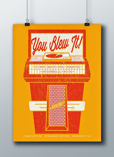
New artist by the name of Billy Sours contacted me and he has some cool looking posters.
I asked him about a couple of the posters:
For the Hotelier poster I knew I wanted to do something hand drawn. Their music is a little bit more emotional than some of the other bands I've done posters for, so I thought a hand done illustration would fit best. The title of the band's most recent album, "Home Like No Place Is There," gave me the idea to play off of the saying, "home is where the heart is." This was translated through the window and the silhouette of the man in the heart.
For the You Blew It! poster I wanted to reference their song "The Fifties" and use some type of vintage imagery. I chose an old jukebox for the subject matter and decided to go with a cleaner look with some texture. I made sure to incorporate the other bands into the art by placing their names inside the buttons of the jukebox instead of just throwing their names in small type on the bottom of the poster (which I regretfully tend to do). I also made sure to reference Richmond, VA (RVA) in the poster somehow and decided to make them the "manufacturer" of the jukebox.
Check out his website and other work http://www.billysoursdesign.com/#home
Posters he has for sale at http://billysoursdesign.bigcartel.com/


No comments:
Post a Comment